An introduction to statistics in R
A series of tutorials by Mark Peterson for working in R
Chapter Navigation
- Basics of Data in R
- Plotting and evaluating one categorical variable
- Plotting and evaluating two categorical variables
- Analyzing shape and center of one quantitative variable
- Analyzing the spread of one quantitative variable
- Relationships between quantitative and categorical data
- Relationships between two quantitative variables
- Final Thoughts on linear regression
- A bit off topic - functions, grep, and colors
- Sampling and Loops
- Confidence Intervals
- Bootstrapping
- More on Bootstrapping
- Hypothesis testing and p-values
- Differences in proportions and statistical thresholds
- Hypothesis testing for means
- Final thoughts on hypothesis testing
- Approximating with a distribution model
- Using the normal model in practice
- Approximating for a single proportion
- Null distribution for a single proportion and limitations
- Approximating for a single mean
- CI and hypothesis tests for a single mean
- Approximating a difference in proportions
- Hypothesis test for a difference in proportions
- Difference in means
- Difference in means - Hypothesis testing and paired differences
- Shortcuts
- Testing categorical variables with Chi-sqare
- Testing proportions in groups
- Comparing the means of many groups
- Linear Regression
- Multiple Regression
- Basic Probability
- Random variables
- Conditional Probability
- Bayesian Analysis
Search these chapters
Plotting and evaluating two categorical variables
3.1 Load today’s data
Before we go further, let’s load today’s data. This keeps all of your data near the top of the script, and makes it much easier to share your script with others.
# Set working directory
# Note: copy this from your old script to match your directories
setwd("~/path/to/class/scripts")

# Load data
titanic <- read.csv("../data/titanicData.csv")
popularKids <- read.csv("../data/popularKids.csv",
                        comment.char = "#")
If you need to download the data, you can do so from these links: titanicData.csv popularKids.csv. Save each to your data directory, and you should be set. Note that for the file popularKids.csv, we’ve added the argument comment.char = "#". This is because the top of that file includes some notes about the file. Many of the files we use this semester will have similar notes, and they will always be proceeded by a #. This is a nice way to keep detailed notes on the files right with them.
The easiest way to see those notes is to open the file. Below are the notes from the file, reproduced to show you quickly what is in the file [*] For those very interested in showing these, you can use this command: cat(paste(grep("^#", readLines("../data/popularKids.csv"), value = TRUE), collapse = " ")) This is running a grep command, very similar to the commandline implementation. the readLines command reads in the file by line without worrying about columns. grep is then pulling out the lines that start with a # (the ^ matches the beginning of a line). paste then puts them together (separated by a new line by the character) and cat prints them to the screen without markup. We will use grep and paste more later this semester. .
## # Downloaded from: http://lib.stat.cmu.edu/DASL/Datafiles/PopularKids.html
## # Datafile Name: Popular Kids
## # Datafile Subjects: Psychology , Social science
## # Story Names: Students' Goals , What Makes Kids Popular
## # Reference: Chase, M. A., and Dummer, G. M. (1992), "The Role of Sports as a Social Determinant for Children," Research Quarterly for Exercise and Sport, 63, 418-424
## # Authorization: Contact authors
## # Description: Subjects were students in grades 4-6 from three school districts in Ingham and Clinton Counties, Michigan. Chase and Dummer stratified their sample, selecting students from urban, suburban, and rural school districts with approximately 1/3 of their sample coming from each district. Students indicated whether good grades, athletic ability, or popularity was most important to them. They also ranked four factors: grades, sports, looks, and money, in order of their importance for popularity. The questionnaire also asked for gender, grade level, and other demographic information.
## # Number of cases: 478
## # Variable Names:
## # Gender: Boy or girl
## # Grade: 4, 5 or 6
## # Age: Age in years
## # Race: White, Other
## # Urban/Rural: Rural, Suburban, or Urban school district
## # School: Brentwood Elementary, Brentwood Middle, Ridge, Sand, Eureka, Brown, Main, Portage, Westdale Middle
## # Goals: Student's choice in the personal goals question where options were 1 = Make Good Grades, 2 = Be Popular, 3 = Be Good in Sports
## # Grades: Rank of "make good grades" (1=most important for popularity, 4=least important)
## # Sports: Rank of "being good at sports" (1=most important for popularity, 4=least important)
## # Looks: Rank of "being handsome or pretty" (1=most important for popularity, 4=least important)
## # Money: Rank of "having lots of money" (1=most important for popularity, 4=least important)
## # The Data:
## #
3.2 Look at two variables
In the last chapter, we covered how to look at a single categorical variable. Let’s do that quickly now for both Gender and Goals. Below is the code to look at Gender. Copy it in and run it. Then, paste it again and run it to look at the Goals column instead (note that you will need to change the code a bit). Note that, for the barplot, we didn’t save the output of table, rather, we just “nested” it within the call to barplot. Either approach works the same.
# Make table of Gender
table(popularKids$Gender)

# Make barplot of Gender
barplot( table(popularKids$Gender) )
So, this tells us how many boys there are, and what goals the students have. From the notes in the file, we see that the Goals column tells us “Student’s choice in the personal goals question where options were 1 = Make Good Grades, 2 = Be Popular, 3 = Be Good in Sports.” So, we can see how many students wanted each of those things.
But, what if, instead, we want to know how many boys want to be good in sports? Can we get that information directly? Of course, or why would I be asking you?
In R, we can do this by making a table with two variables. Let’s do that here (note, we are saving the table because we are going to use it several times).
# Save a table of the two-way interaction
genderGoals <- table(popularKids$Gender, popularKids$Goals)

# Enter the variable name to actually see it
genderGoals
##
## Grades Popular Sports
## boy 117 50 60
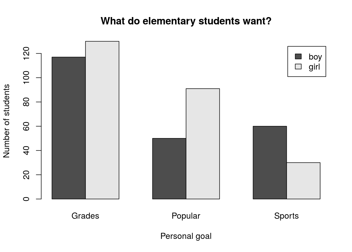
## girl 130 91 30So, we see here that 50 boys want to be popular, and 130 girls want good grades. We also get a hint that there might be some differences between boys and girls. Let’s look at this in a plot to see if that makes it more clear. First, let’s see what happens if we just call barplot on this.
# Make a simple barplot
barplot(genderGoals)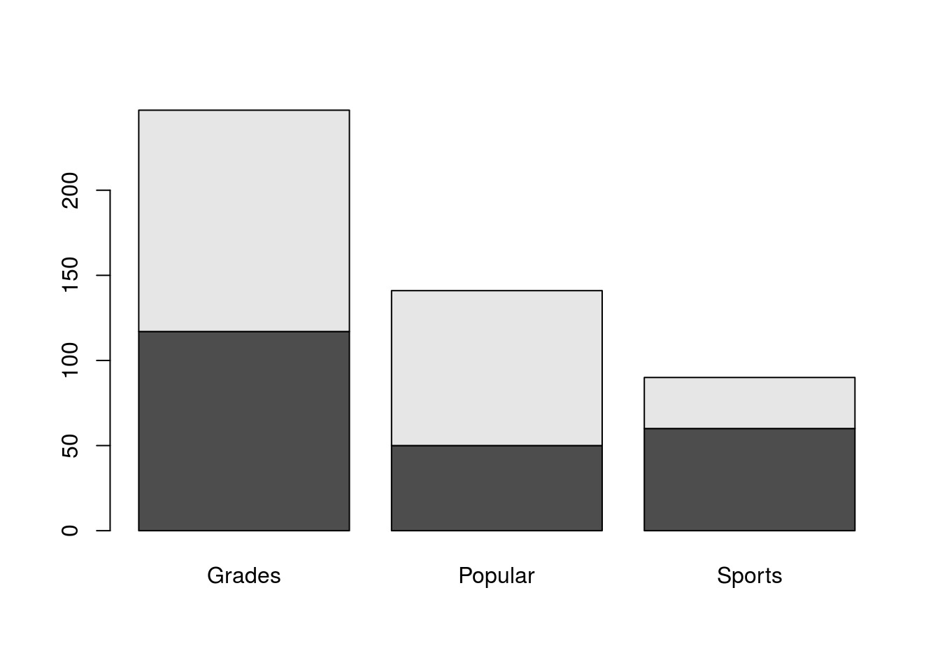
That does an ok job, but it certainly isn’t as clear as it could be. For one thing, do you know which color is boys and which is girls? Let’s start by fixing that. The easiest way to get more information on a function is to run ?functionName which will pull up a help file. So, run ?barplot and see a ton of options for the function (note, if you type this in your script, I recommend you comment it out to avoid problems when compiling).
What we probably want is a legend, and the help tells us that there is an argument legend.text = that we can use to set it. If we just set it to TRUE, R will automatically use the row names to make a legend. Try it by adding legend.text = TRUE to your function, so that it looks like this:
# Make a simple barplot
barplot(genderGoals, legend.text = TRUE)
This gets us part way there, but we can still do more. I prefer to have barplots where the bars are next to each other, rather than on top of each other. The help tells us about beside =, which controls this – setting beside = TRUE will make the bars be side-by-side instead of stacked. So, add that to the function.
We also probably want some labels for the plot and axes. So, use the main =, xlab =, and ylab = arguments to set labels. Your plot should look something like this (though you may choose different labels)
3.3 Putting it together
As before, let’s now try to do this a bit more compactly. Here, we will keep working with this same data set, but will now ask about the column Urban.Rural (which tells us where the school is) as it relates to Goals. Essentially, we are curious to know if the location of the school has anything to do with the goals of its students. Importantly, we will talk more soon about how we can (and cannot) interpret results like this and will return much later in this tutorial to analyze it more formally.
So, let’s save a table and plot it right away, using the tweaks we used above (change labels if you’d like).
# Save a table of location and goals
locGoals <- table(popularKids$Urban.Rural,
                  popularKids$Goals)
# View the table
locGoals
##
## Grades Popular Sports
## Rural 57 50 42
## Suburban 87 42 22
## Urban 103 49 26# Plot the result
barplot(locGoals,
legend.text = TRUE,
beside = TRUE,
main = "Does location matter?",
xlab = "Personal goal",
ylab = "Number of students")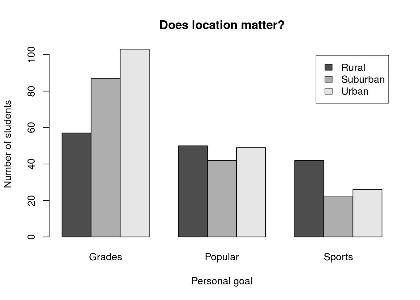
This plot shows us an interesting pattern, where the distribution of bars for each group looks fairly similar. However, it is hard to make much of this from the current plot.
3.4 Changing the order
One simple solution is to simply change the way the bars are grouped. Perhaps if all of the “Rural” bars were next to each other, we would be able to see a pattern more clearly. The barplot() function uses columns to group and colors the separately. So, we need to switch the rows and columns. There are (at least) two ways that we can accomplish that.
The first, trivial, way to do this is to simply re-create the table, but this time pass the arguments in the opposite order. To try this, create a new variable to hold the new table (we’ll still want the old one in a moment).
# Save a table of location and goals
locGoalsB <- table(popularKids$Goals,
                   popularKids$Urban.Rural)
Look at the table and plot it. Notice that it reversed the order, just like we wanted. So, if you know ahead of time (or are willing to re-do things) you can set your table up in the “correct” order. However, we may often find ourselves wanting to plot both orders. Luckily, there is a simpler way.
What we want to do is called “transposing” the rows and columns, and R has a built-in function to do it for us: t(). This function takes any table-like variable[*] Technically, it is looking for anything that can be coerced into a two-dimensional matrix and returns it with the rows and columns swapped. This can be a really handy trick in a lot of instances, especially when you start working in research and have big messy data files. Let’s compare what happens when we use it to our second table:
# Display the table transposed
t(locGoals)
##
## Rural Suburban Urban
## Grades 57 87 103
## Popular 50 42 49
## Sports 42 22 26Now we can use that transposed table to plot by calling t(locGoals) directly within the barplot arguments (you should also add axis and title labels).
# Plot the transposed table
barplot(t(locGoals),
        legend.text = TRUE,
        beside = TRUE)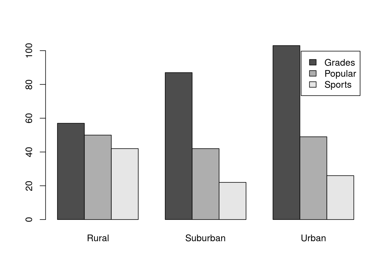
For now, we won’t worry about where the legend is[*] It can be changed either by turning off the legend and supplying it manually with the legend() function, or by passing a list of named arguments to barplot() using the args.legend = argument. For now, see the help for legend for more information. , even if it is not in an ideal place. The plot shows us clearly that, in all locations, There is a drop off in number of students choosing Grades to Popular to Sports, but that the drop off seems much less dramatic in the Rural schools.
3.5 Try it out (I)
Now it’s your turn to try it out again. Make a plot of the difference in goals by gender with the bars reversed from before. Your final plot should look something like this:
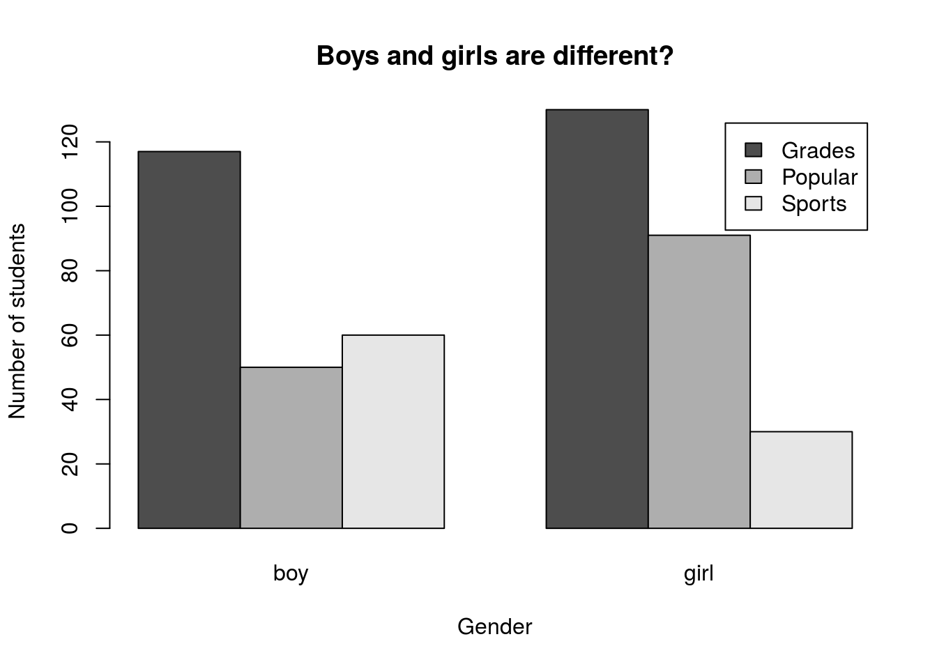
What does this output suggest to you? Include a comment about interpretation in your script.
3.6 Manipulating the counts
Sometimes, the raw counts aren’t enough information. To illustrate this, let’s transition to the titanicData and ask how likely a person was to survive if they were in each class on the Titanic. First, let’s make a two-way table.
# Save a two-way table of survival
survivalClass <-  table(titanic$survival,titanic$class)
Then, use the code from above to make a plot like this one, including axis labels:
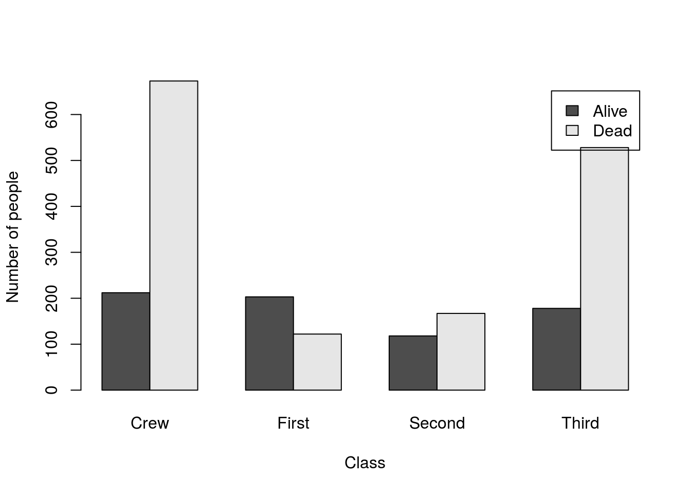
Can you easily compare the survival rates in each group? I know I can’t. With such different numbers in each group, it is really difficult to accurately compare any rates between them. We can see these drastic differences in number by using the function addmargins() to see group totals:
# Look at the margins
addmargins(survivalClass)
##
## Crew First Second Third Sum
## Alive 212 203 118 178 711
## Dead 673 122 167 528 1490
## Sum 885 325 285 706 2201Note the addition of the “Sum” column. This is called a “marginal” total (like in the name of the function) because they were literally written in the margins around the table when these things were still calculated by hand. Now, they just mean that we add up the occurance of a variable without regard to any other variable. That is, the marginal distribution of our column totals is just the same as the count of the number of people in each class (like we calculated in the last tutorial).
So, what we really want to see is something called the “conditional” distribution of survival. That is, we want to know what proportion of people survived given that they were in each class (their “condition” is “First” class, for example).
So, for the Crew, we want to divide 212 by 885 to calculate the survival rate. We could do this by hand for a few, but (as is often the case) there is a faster way: the function apply(). It takes three arguments:
- a set of data (usually a matrix or data.frame),
- a margin (which direction to analyze rows = 1, columns = 2), and
- a function to calculate.
We have already been using this a bit when we call addmargins, but sometimes we want something with more control. We’ll start with some simple examples where we just call a named function.
# Calculate the sum of people in each class
apply(survivalClass, 2, sum)
## Crew First Second Third
## 885 325 285 706# Calculate the sum of people that lived and died
apply(survivalClass, 1, sum)## Alive Dead
## 711 1490This is just calculating the marginal totals we had before. However, many functions will work on this directly, and we will see several of them. We can even write our own functions to work in apply. For example, we may want to add the sum of the row/column to every value in the row/column for some reason. The convention tends to be to just name the variable x for simple functions[*] I use much more descriptive variable names for longer functions (I have written apply/lapply functions that were dozens of lines long).
# Add the number in each row (survival) to the values in that row
apply(survivalClass, 1, function(x) {
  x + sum(x)
})
##
## Alive Dead
## Crew 923 2163
## First 914 1612
## Second 829 1657
## Third 889 2018# Add the number in each column (class) to the values in that row
apply(survivalClass, 2, function(x) {
x + sum(x)
})##
## Crew First Second Third
## Alive 1097 528 403 884
## Dead 1558 447 452 1234We can write basically anything we want in that function, and it will treat our variable (here x) as a new variable and return the values in a sensible way.
Now, back to the question at hand. What we want to plot is the proportion of each class that survived/ So, we need to divide each column (margin = 2) of the survivalClass table by its sum.
# Calculate proportions within columns
apply(survivalClass, 2, function(x) {
  x / sum(x)
})
##
## Crew First Second Third
## Alive 0.239548 0.6246154 0.4140351 0.2521246
## Dead 0.760452 0.3753846 0.5859649 0.7478754Now, we can plot it. We can save that table and then pass it in directly, if we want, but we can also just include it in the call to barplot. Either is appropriate and will produce the same plot. For larger data sets, saving the proportions table will save computational time by not re-running it each time you run/tweak the plot.
# Plot the conditional distribution
barplot( apply(survivalClass, 2,
               function(x) {x / sum(x)}),
         legend.text = TRUE,
         ylab = "Proportion surviving",
         xlab = "Class"
         )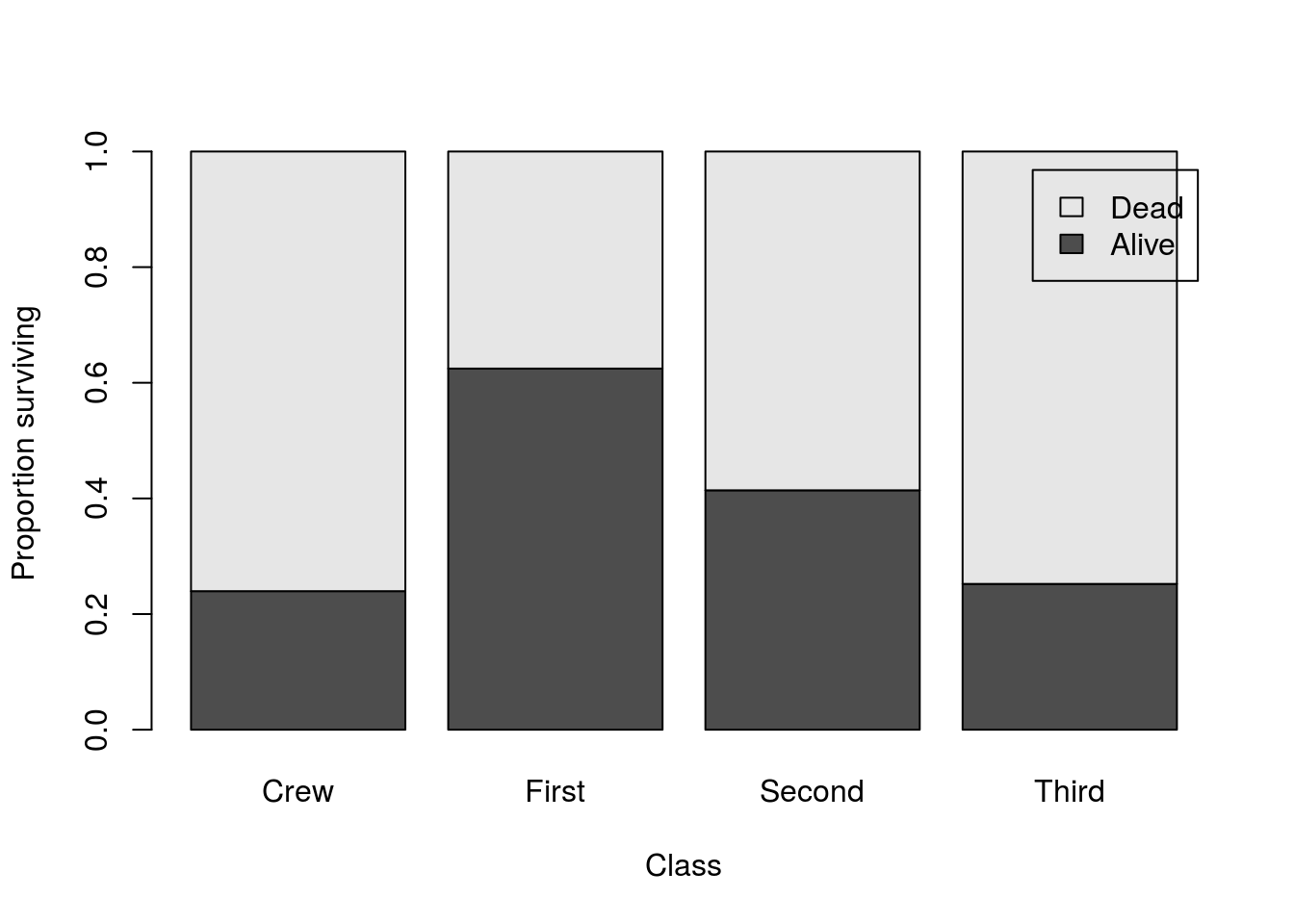
Because this plot shows the proportion surviving within each class, it is much easier to compare them against each other. It is clear that First Class passengers survived at a much higher rate than did Third Class passengers or the Crew. Without this correction, it would be very difficult to see that.
3.7 See it together
This time, we’ll see whether women were more likely to survive than men. The steps will be almost identical: make a table then calculate and plot the conditional distributions.
# Make a table of gender by survival
survivalGender <- table(titanic$survival,titanic$gender)

# Plot the conditional distributions
barplot( apply(survivalGender, 2,
               function(x) {x / sum(x)}),
         legend.text = TRUE,
         ylab = "Proportion surviving",
         xlab = "Gender"
         )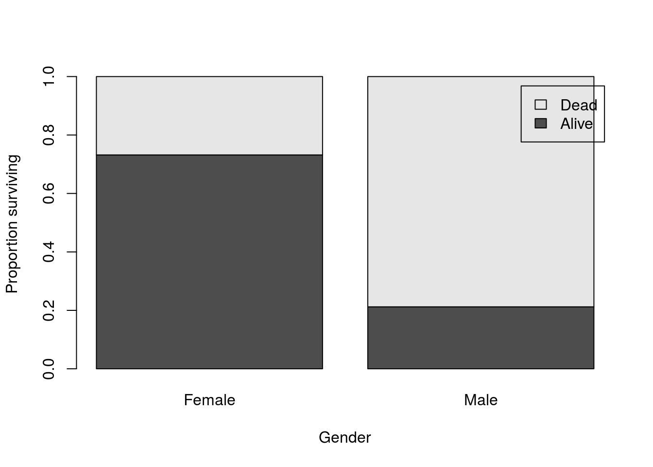
And we can see the huge difference in survival between men and women on the Titanic, though the much smaller number of women on the Titanic (470 women compared to 1731 men) would mask that difference if we didn’t calculate the conditional distributions. We can see this when we look at the table as fewer women survived than men:
# Look at the raw counts
survivalGender
##
## Female Male
## Alive 344 367
## Dead 126 13643.8 Try it out (II)
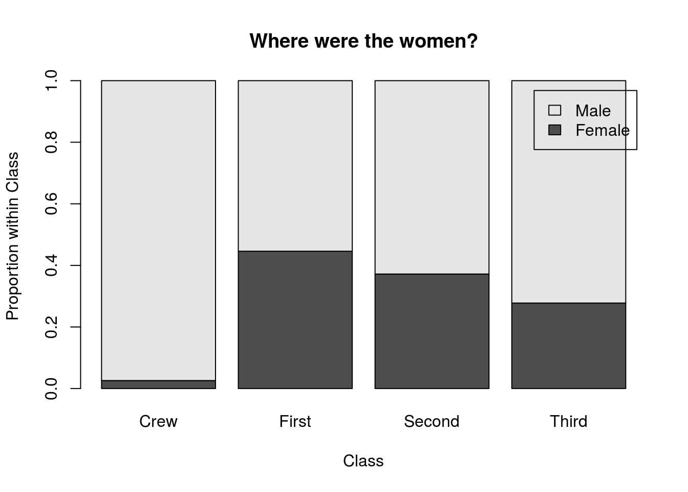
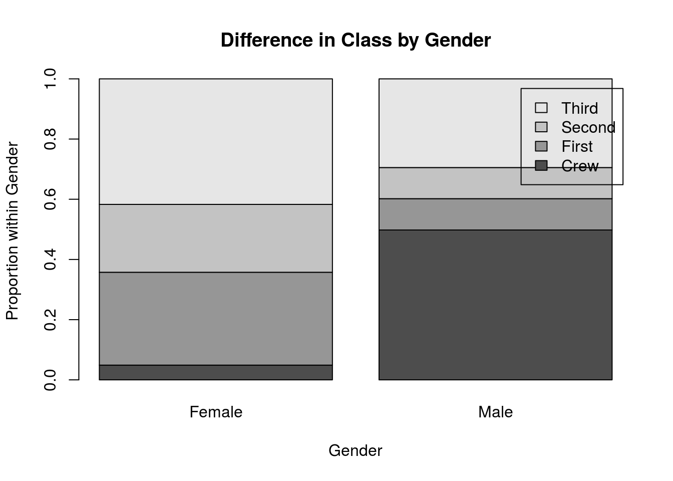
Finally, you are going to try to apply two of the lessons learned here together. To do this, we will look at the distribution of genders in each class, and the distribution of classes in each gender (note the change in the conditional we are calculating). Use the columns gender and class to generate plots like these two:
3.9 Output
As with other chapters, click the notebook icon at the top of the screen to compile and HTML output. This will help keep everything together and help you identify any errors in your script.